BlackRock ‘s Web Design

http://www.blackrock.com/

STRATEGY & BRANDING

BlackRock website ‘s objective is to build a strong online platform for individuals and institutional investors to access to information, data, and company’s resources. For new clients, the website serves as an important tool for BlackRock to introduce its financial products offered (different types of funds), investment objectives (i.e. risk tolerance, return tradeoff, etc.), investment methods (i.e. emerging markets, S&P 500 portfolio, algorithm, etc.).

The website is more about a tools for customers to access and use the information rather than a webpage to attract new customers. (Because most BlackRock’s customers are large banks, and institutional investors) 

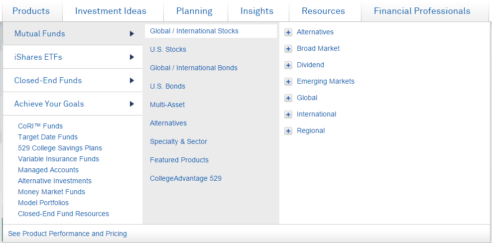
Strategy to make an effective website: BlackRock’s webpage has the perfect balance of data presentation, visual icons, and interactive animations. The data is informative, clear, and super well-organized. There is no redundant parts. The data is presented and organized super effective. The website design not only save time for its clients but also provide aesthetically pleasing presentation of data and information.

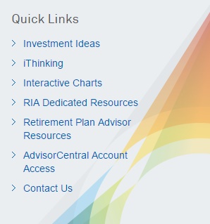
User could navigate & access information quickly and effectively. Information (Data, graphs, date, text, etc) is displayed effectively .

Unique Branding traits: colorful, simple, minimalist, aesthetically pleasing design elements, professional looking. Design is not “overdone”, and not “too showy”.

DESIGN

BlackRock create effectieve, clean, well-organized information with data, graphs, and investing recommendations. Very good balance of texts, visual design elements (sizes, positions) help customers covey the infomation effectively. There is no redundant parts in design.

Design Element:

Color: Clean. High contrast with standard white background, consistency in color. blue links, and black text. Visual elements are colorful and aesthetically pleasing.

1

Visual Style: colorful, simple, minimalist, aesthetically pleasing design elements, looking very profesional. Design is not “overdone”, and not “too showy”.

12223455344xasa


Some of the design elements

Overal Visual Critique: Very good balance of texts, visual design elements (sizes, positions), very effective data presentation for targeted customers: clean, simple, informative, well-organized, aesthetically pleasing.

123

133


33334444

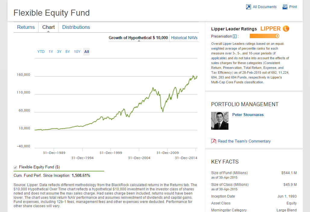
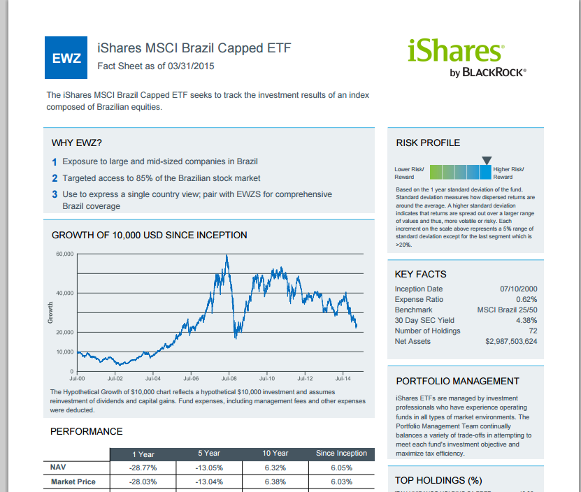
Data, Charts, Graphs are very well-organized, and clear. PDF documents are included

TECHNOLOGIES

  • HTML5
  • Web Server: Apache
  • JavaScript Libraries: JQuery, JQuery UI, D3 JS, HighCharts.
  • Analytics and Tracking: Google Analytics, Omniture SiteCatalyst, etc

Ruddy Roye Photography

http://www.ruddyroye.com/

Overview

    ruddyroye.com is home to the work of Brooklyn based documentary photographer, Radcliffe “Ruddy” Roye. Roye focuses his work on editorial and environmental portraits as well as photo-journalism photography.

Focus

    This website shares the work done by Roye which aims to “subtly awake the subconscious and expose the isolated figure or vision painted within a rhetorical frame”. This website focuses on sharing the work of Ruddy Roye, sharing other forms of media Ruddy uses to share his work, and contact information for bookings or correspondence instead of another photographer in Roye’s field because Roye’s work has a touch that makes his photos unique.
    Roye’s work is done around the United States, so visitors from all around could find this site appealing. Most of his work is gritty, urban focused photography so that could draw that audience. I feel that this site’s personality is heavily focused on the work. The site doesn’t present any flashy navigation or animations because I feel that it would take away from the focus of the photography.

Screenshot (30)Screenshot (32)

Review

    One critique I have of the site is that the photos can not be enlarged for closer viewing. They are fixed to their size in whatever gallery they are presented in. Although another positive of the site is the contact information, and links to other media sites Roye utilizes are easy to locate. Overall, its focused to be presented professionally, working well with the serious subject matter of Roye’s work. The simplicity of the layout, features, and navigation of the site all come back to the main focus of the website, the photography.
          Technology: HTML 5, SWF Address, CSS Orientation Media Query

Digital Metaphor of the effect that Alzeihemer’s Disease has on the brain

http://i-remember.fr/en

I have chosen this very amazing website because it is serving a good cause. it has been designed very well and is very engaging. It has a very community, home-like, dreamy feel to it. The website is helping to spread awareness about the seriousness of Alzheimer’s and get people involved with this digital metaphor but it does so in such a light way. The site is very emotional but uplifting at the same time.

Website Name

I-remember.fr/en

The company is in the presence of the percentage of people who are feel strongly about Alzheimer and people with Alzheimer.

The objective of this website is to allow everyone to share their memories while they still can.
The website’s strategy statement would probably be:

Allow people to feel at home and want to share their memories. Keep the website dark but have light for the people to draw near. The goal is to keep the website simple, the website is the people and their stories. Allow them to feel secure and happy.

The target audience of this website is the percentage of people who have Alzheimer’s disease and the people who are spreading awareness about Alzheimer’s disease.

The website personality is caring, open, close, dreamy and warm.

Personality image

Mo’ne Davis is who this website would be if it were a person, because it has a youthfulness too it and a sense of resilience.

Website Traits

  1. Welcoming
  2. Unity
  3. Uplifting
  4. Close-knit
  5. young

Voice

If the website could speak it would speak calmly, and in a warm caring motherly tone because mothers are often associated with words such as warmth, openness, willingness, loving, home, comfort and support.

Visual Lexicon

Dark, night light like, dream-like, inviting.

Engagement Methods

The emotional engagement methods are making the people’s memories the lights because there is light in the people’s memories.

Case Study Analysis and Critique

The strength of the website is that it is immediately engaging and gives two sentences for its purpose right away. Then it gets better and you see light and you want to draw near the light and see what’s going on. The weakness would be the navigation.


Cutting Edge Design with Demodern

Strategy & Branding
The websites strategy is cutting edge, interactive, holistic, engaging, and innovative. The purpose of the website is to show the viewer who the company is and what they do. People interested in using the service that DeModern provides and people interested in working for DeModern are most likely going to be satisfied with the website. The website uses space, font size, and images to keep the viewer engaged. The information is balanced with composition. The whole website is about design thus their website design should have (and does) a lasting impression. The content is prioritized well. The first few pieces of information prove to be the most important. The visual hierarchy is very impressive. The video really grabs the viewer and allows them to be exposed gradually to the other media and visual components of the site. They even explicitly state their design strategy, which is to establish common objectives and success factors while focusing on the big picture. I think the website displays this quite well. They want the user experience to be as pleasant and enjoyable as the aesthetic experience. And finally they obviously incorporate appropriate technologies to complete the design.

Design
The design of the site is unique. They introduce the website with a silent video of the work place. The first thing you see is people laughing and smile and a title that types: “welcome”. This video is a series of clips showing how the employees work together and enjoy the work environment. This initial sneak peak of the company instantly makes you feel comfortable, happy, and curious. The navigation bar is hidden but can appear by clicking the icon on the top left at any time. The navigation bar is not immediately visible perhaps to allow the website viewer to stay on the main page. The main page can easily be scrolled through to get information about the company. The main page is a series of pages/sections that have contrasting backdrops when appropriate. The first few sections are closely related. First is the video, then their mission statement, and then information on previous projects with pictures. These first three pages gives the viewer a sense of what the company does. These pages are a good introduction and transition nicely to the rest of the information on the main scrolling home page. The main scrolling page continues with a page on their design process, after that is a list of their clients logos (so the viewer will recognize what type of companies they work for), and then a section about the designers. These three pages really allow the viewer to understand how and why the company designs. To end the page is a game you can play. The game really leaves the viewer having a sense of who DeModern really is. The company is serious yet fun. They are committed to their design mission and at the same time are committed to making people happy. The website starts and ends in a unique, interactive, and positive way. Following every section is a link to get more information about the particular topic. The design allows the viewer to understand the most important details about the company but allows the opportunity to branch off and get a thorough understanding of a particular aspect of the company (i.e. the designers, products). Information is grouped together in blocks, which really simplifies the site and allows the visual hierarchy to flow. The pages all have a similar layout, which also simplifies the sites content (visually). The size, color, and style of the fonts are very comfortable to look at. They allow the titles to be bigger and bolder while the descriptions are grey. The pictures really stand out and let the product speak for itself.

Screen Shot 2015-03-30 at 9.16.30 PM

Technologies
The website uses HTML 5. Transform matrix on the images so that they slowly zoom when you scroll over them. They use all .pngs and one .jpg. They use google analytics, google font API, JQuery fro javascript framework, lightbox for phtoto gallery and javascript framework, modernizer for javascript framework, requireJS for javascript framework, and three.js for javascript graphics.

Explore your favorite Zoo Animals zoo.sandiegozoo.org

The San Diego Zoo has a fantastic website, that contains an international wildlife refuge, and is world renowned. It is more than a zoo, it is also a research facility. The websites purpose is to inform visitors on tickets, wild life experiences, and animals. On the website this information is presented through interactive wildlife, blogs, and educational videos. The target audience for this website is families with young children or anyone interested in animal studies. Based off of the reading in chapter 18 the strategy used in this website that makes it so successsful is presenting information in a unique way that helps visitors achieve their goals, and creating an attractive professional site.

Screen Shot 2015-04-05 at 1.39.12 PM

The design of the website helps the site deliver a message or drive the viewer to take action in many different ways such as card sorting, distinct, and visual hierarchy. After observing zoo.sandiegozoo.org numerous times I noticed that the site used the card sorting technique which helps decide which information goes on each page. I determined this by how well organized the site is and how easy it is to find information. The pages and headings appear to be in different styles which indicates that the focus was trying to make the page look distinct so that everything does not look the same and boring. Visual hierarchy delivers a message on the site. Key messages were focused and guided through very well. The design displays the target audience because it is very colorful and fun. When children or parents see this it gives them a welcoming and playful vibe that attractives visitors to want to continuing viewing the site and visit the zoo. The visual design itself is clear, functional and displays great structure content.  The navigation is smooth and easy to follow allowing users to find information quickly and efficiently.

Technologies Used

  • HTML5 Doc Type
  • Java Script
  • WordPress


Why travel with mappingmegan.com

as you open the mappingmegan.com website it is a travelers dream, there is a world map who acts like a destination map where you can click on countries and state and found information about that particular city or state. Mappingmegan.com found a way to incorporate simplicity and traveling, the site provides information on a certain place with a star rating, if you don’t have an idea of where to go click on something and see what mappingmegan.com has to say about it, or you can filter by star ratings, from adventures to, travel videos, personal journals and tourist attractions.

If you click on destination it provides a n aura of information such as picture and a brief description of the picture. she provides a list of other awesome travelers blogs that you can utilized for more information, list of equipments that you might want to purchase to make your journey that more satisfying. she also have advice on how to save money, that old age question that everyone ask when they want to travel but can’t figure out how to do in this horrible economy.
She also provide her “our country countdown” to show readers where she’s been and where she would like to go, she has her “ travel bucket list”, the site is easy to navigate when compared to other travel site out there that are not well organized too much information, that just drives you crazy.


What do they use:

HTML 5, CSS, Java Script

Meesuka Morelus

why i am a fan of i am a food blog

Landing on the site iamafoodblog.com will be simultaneously one of the best and worst decisions of your life. Best, because it is a well-run food blog with a sizzling aesthetic, great narration, and recipes for delicious food. Worst– well, because landing on this blog means you will immediately be hungry.

iamafoodblog


i am a food blog is an award-winning food blog run by food writer and chef Stephanie Le. Among some of the best food blogs on the web, Le’s i am a food blog has recently won Saveur’s 2014 Best Blog of the Year, and also helped Le land a contract to publish her recently released cookbook easy gourmet.

i am a food blog aims to perform at the top level of what most food blogs desire to achieve–a combination of the best food photography, most interesting stories, and mouth-watering recipes. Le’s blog in particular tends to balance the mass appeal of foods like noodles, potatoes, bacon, and breakfast foods with a desire to replicate the highest of dining experiences. Add a pinch of Japanese influence, and the kitchy yet high-quality cuisine of Stephanie Le is born. Le’s dynamic style attracts the attention of a wide variety of foodies, likely with a big following coming from the DIY and food-loving Millenials especially.

Stephanie Le’s i am a food blog stands out for more than just its recipes and photography. As Nina Burleigh points out in her article What Silicon Valley Thinks of Women, the tech industry is largely male dominated. Not only is Le a successful blogger, but she is also a published author, chef, and freelance artist. And yet, Le has done all of this without sacrificing her personality or humanity. Le’s blog reminds us that food culture and conversation can exist outside of the framework of consumerism and aesthetic elitism. You don’t have to go to a four-star restaurant, take cooking classes, or purchase a cable subscription to Food Network to be able to cook and eat great food.  Food blogs provide a virtually free and easy-to-access platform for learning and talking about food. Not only that, but they also encourage the infusion of personality into virtual public spaces, offering ways to engage with each other and restore meaning to our online communications.

Le’s design of i am a food blog is simple, high-contrast, and bold. i am a food blog immediately engulfs the viewer with salivating food imagery upon entering the site. After the initial high-impact landing, Le’s blog easily flows into a simple tile design of her latest posts to encourage further reading. With only one basic navigation panel that alternates between a header position and a left column position as you shift to and from different types of pages, Le’s design balances minimalism with novelty and finesse. Further, Le’s employment of clean design and professional-quality photography help attract her demographic of young DIY foodies, especially in this day and age where posting pictures of food has become increasingly popular on social media across the spectrum. Altogether, Le’s design succeeds in producing an easy-to-navigate site attractive to her food-loving Millennial demographic.

Technologies used:

  • HTML version: XHTML 1.0 Transitional
  • Content management: WordPress
  • Additional technologies: CSS, Javascript
  • Stylesheets: main, fonts

Spyder

Spyder is a high end ski apparel company based out of Colorado. In Spyder’s code for their main website was Javascript,Google analytics, JQUERY and  which is was used for the animations  on each photo of the company’s team which is located on the about us page. Spyder.com is the official website for this international brand. This is a HTML 5 website built for commerce and has many advertisements for its current/ future products. Spyder’s niche is that they not only sell high end ski apparel but a lifestyle as well. You can see on the website how much support they have for their company by the amount of co-branding and sponsors they have. The organized but artistic layout of the way they sell their products attracted me to this website when I was online looking for coats one day, even though I never bought anything I still thought it was cool.

Pacha Ibiza

http://www.pacha.com/

This website has HTML 5, has JavaScript, WordPress plugin and JQuery.  This website is the official website of Pacha Ibiza. Pacha is a disco club that is situated in the island of Ibiza in Spain. This is one of the best disco clubs in the world, and the most popular in Spain. In the website there are a lot of pictures and videos of the parties of this club, and also we can find the next parties and buy tickets. The first purpose of this website is for buy the tickets for events, and also you can buy clothes or products from the brand Pacha. The visual design of the website I like for the pictures that appear, the most important elements in this website are the pictures from the events.

BlackNegative

http://blacknegative.com/#!/whoweare/

Black Negative is a navigation website for online website designer to promote his craft in designing webpages. This website is one of the many sites that are going with the flash image without actually using it. Black Negative uses HTML 5, CSS 3 and Javascript. This site is a navigation site to promote different corporations. It also illustrates liquid design. The sites style sheet is http://blacknegative.com/skins/blacknegative/css/min.css .