Ruddy Roye Photography

http://www.ruddyroye.com/

Overview

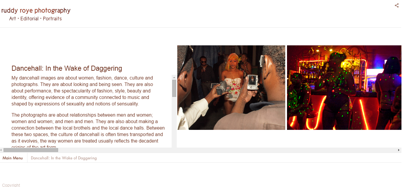
    ruddyroye.com is home to the work of Brooklyn based documentary photographer, Radcliffe “Ruddy” Roye. Roye focuses his work on editorial and environmental portraits as well as photo-journalism photography.

Focus

    This website shares the work done by Roye which aims to “subtly awake the subconscious and expose the isolated figure or vision painted within a rhetorical frame”. This website focuses on sharing the work of Ruddy Roye, sharing other forms of media Ruddy uses to share his work, and contact information for bookings or correspondence instead of another photographer in Roye’s field because Roye’s work has a touch that makes his photos unique.
    Roye’s work is done around the United States, so visitors from all around could find this site appealing. Most of his work is gritty, urban focused photography so that could draw that audience. I feel that this site’s personality is heavily focused on the work. The site doesn’t present any flashy navigation or animations because I feel that it would take away from the focus of the photography.

Screenshot (30)Screenshot (32)

Review

    One critique I have of the site is that the photos can not be enlarged for closer viewing. They are fixed to their size in whatever gallery they are presented in. Although another positive of the site is the contact information, and links to other media sites Roye utilizes are easy to locate. Overall, its focused to be presented professionally, working well with the serious subject matter of Roye’s work. The simplicity of the layout, features, and navigation of the site all come back to the main focus of the website, the photography.
          Technology: HTML 5, SWF Address, CSS Orientation Media Query

Digital Metaphor of the effect that Alzeihemer’s Disease has on the brain

http://i-remember.fr/en

I have chosen this very amazing website because it is serving a good cause. it has been designed very well and is very engaging. It has a very community, home-like, dreamy feel to it. The website is helping to spread awareness about the seriousness of Alzheimer’s and get people involved with this digital metaphor but it does so in such a light way. The site is very emotional but uplifting at the same time.

Website Name

I-remember.fr/en

The company is in the presence of the percentage of people who are feel strongly about Alzheimer and people with Alzheimer.

The objective of this website is to allow everyone to share their memories while they still can.
The website’s strategy statement would probably be:

Allow people to feel at home and want to share their memories. Keep the website dark but have light for the people to draw near. The goal is to keep the website simple, the website is the people and their stories. Allow them to feel secure and happy.

The target audience of this website is the percentage of people who have Alzheimer’s disease and the people who are spreading awareness about Alzheimer’s disease.

The website personality is caring, open, close, dreamy and warm.

Personality image

Mo’ne Davis is who this website would be if it were a person, because it has a youthfulness too it and a sense of resilience.

Website Traits

  1. Welcoming
  2. Unity
  3. Uplifting
  4. Close-knit
  5. young

Voice

If the website could speak it would speak calmly, and in a warm caring motherly tone because mothers are often associated with words such as warmth, openness, willingness, loving, home, comfort and support.

Visual Lexicon

Dark, night light like, dream-like, inviting.

Engagement Methods

The emotional engagement methods are making the people’s memories the lights because there is light in the people’s memories.

Case Study Analysis and Critique

The strength of the website is that it is immediately engaging and gives two sentences for its purpose right away. Then it gets better and you see light and you want to draw near the light and see what’s going on. The weakness would be the navigation.


Cutting Edge Design with Demodern

Strategy & Branding
The websites strategy is cutting edge, interactive, holistic, engaging, and innovative. The purpose of the website is to show the viewer who the company is and what they do. People interested in using the service that DeModern provides and people interested in working for DeModern are most likely going to be satisfied with the website. The website uses space, font size, and images to keep the viewer engaged. The information is balanced with composition. The whole website is about design thus their website design should have (and does) a lasting impression. The content is prioritized well. The first few pieces of information prove to be the most important. The visual hierarchy is very impressive. The video really grabs the viewer and allows them to be exposed gradually to the other media and visual components of the site. They even explicitly state their design strategy, which is to establish common objectives and success factors while focusing on the big picture. I think the website displays this quite well. They want the user experience to be as pleasant and enjoyable as the aesthetic experience. And finally they obviously incorporate appropriate technologies to complete the design.

Design
The design of the site is unique. They introduce the website with a silent video of the work place. The first thing you see is people laughing and smile and a title that types: “welcome”. This video is a series of clips showing how the employees work together and enjoy the work environment. This initial sneak peak of the company instantly makes you feel comfortable, happy, and curious. The navigation bar is hidden but can appear by clicking the icon on the top left at any time. The navigation bar is not immediately visible perhaps to allow the website viewer to stay on the main page. The main page can easily be scrolled through to get information about the company. The main page is a series of pages/sections that have contrasting backdrops when appropriate. The first few sections are closely related. First is the video, then their mission statement, and then information on previous projects with pictures. These first three pages gives the viewer a sense of what the company does. These pages are a good introduction and transition nicely to the rest of the information on the main scrolling home page. The main scrolling page continues with a page on their design process, after that is a list of their clients logos (so the viewer will recognize what type of companies they work for), and then a section about the designers. These three pages really allow the viewer to understand how and why the company designs. To end the page is a game you can play. The game really leaves the viewer having a sense of who DeModern really is. The company is serious yet fun. They are committed to their design mission and at the same time are committed to making people happy. The website starts and ends in a unique, interactive, and positive way. Following every section is a link to get more information about the particular topic. The design allows the viewer to understand the most important details about the company but allows the opportunity to branch off and get a thorough understanding of a particular aspect of the company (i.e. the designers, products). Information is grouped together in blocks, which really simplifies the site and allows the visual hierarchy to flow. The pages all have a similar layout, which also simplifies the sites content (visually). The size, color, and style of the fonts are very comfortable to look at. They allow the titles to be bigger and bolder while the descriptions are grey. The pictures really stand out and let the product speak for itself.

Screen Shot 2015-03-30 at 9.16.30 PM

Technologies
The website uses HTML 5. Transform matrix on the images so that they slowly zoom when you scroll over them. They use all .pngs and one .jpg. They use google analytics, google font API, JQuery fro javascript framework, lightbox for phtoto gallery and javascript framework, modernizer for javascript framework, requireJS for javascript framework, and three.js for javascript graphics.

Explore your favorite Zoo Animals zoo.sandiegozoo.org

The San Diego Zoo has a fantastic website, that contains an international wildlife refuge, and is world renowned. It is more than a zoo, it is also a research facility. The websites purpose is to inform visitors on tickets, wild life experiences, and animals. On the website this information is presented through interactive wildlife, blogs, and educational videos. The target audience for this website is families with young children or anyone interested in animal studies. Based off of the reading in chapter 18 the strategy used in this website that makes it so successsful is presenting information in a unique way that helps visitors achieve their goals, and creating an attractive professional site.

Screen Shot 2015-04-05 at 1.39.12 PM

The design of the website helps the site deliver a message or drive the viewer to take action in many different ways such as card sorting, distinct, and visual hierarchy. After observing zoo.sandiegozoo.org numerous times I noticed that the site used the card sorting technique which helps decide which information goes on each page. I determined this by how well organized the site is and how easy it is to find information. The pages and headings appear to be in different styles which indicates that the focus was trying to make the page look distinct so that everything does not look the same and boring. Visual hierarchy delivers a message on the site. Key messages were focused and guided through very well. The design displays the target audience because it is very colorful and fun. When children or parents see this it gives them a welcoming and playful vibe that attractives visitors to want to continuing viewing the site and visit the zoo. The visual design itself is clear, functional and displays great structure content.  The navigation is smooth and easy to follow allowing users to find information quickly and efficiently.

Technologies Used

  • HTML5 Doc Type
  • Java Script
  • WordPress